When people think of branding, they often think of a logo, a business card, or a cute Instagram grid. But branding goes far beyond what something looks like — it’s about what it feels like.
Your brand should reflect the heart of your work, the way you make people feel, and the message you want to send — before you even say a word. That’s why when I chose my colors for Graceful Rose Photography, I didn’t just pick what was trendy or cute.
I picked colors that feel like me.
And more importantly — that feel like you.
🌱 Why I Chose Moss Green & Soft Peach
My core brand colors — moss green and soft peachy pink — weren’t just a design choice. They’re an extension of how I want my clients to feel from the moment they land on my website or step in front of my lens.
💚 Moss Green: Calm. Grounded. Intentional.
Moss green is the foundation of my branding for a reason. It feels steady and natural — like deep breaths, golden hour fields, and being exactly where you’re meant to be.
It reflects the peace I want my sessions to bring. Whether you’re a senior stepping into your next season or a couple embracing your love story, I want you to feel at ease — unhurried, seen, and safe.
🎨 Color Psychology Insight:
Green is often associated with nature, healing, and tranquility. Specifically, moss green feels earthy and stable — signaling reliability, renewal, and emotional balance. Studies show that green environments can reduce stress and enhance feelings of calm and safety.
🩷 Soft Peach: Warmth. Connection. Joy.
Peachy pink brings softness and warmth. It’s a color that says “you’re welcome here.” It feels gentle, honest, and kind. It reminds me of laughter during a family session, the quiet glow in a mama’s eyes, or the joy of being fully present in the moment.
It’s a reminder that photography isn’t just about the perfect pose — it’s about how it feels to be there.
🎨 Color Psychology Insight:
Peach tones combine the nurturing energy of pink with the optimism of orange. Psychologically, peach evokes friendliness, compassion, and emotional warmth. It’s a color that builds trust and encourages genuine connection — perfect for inviting people to be their true selves in front of the camera.
✨ These Colors Show Up in My Photos, Too
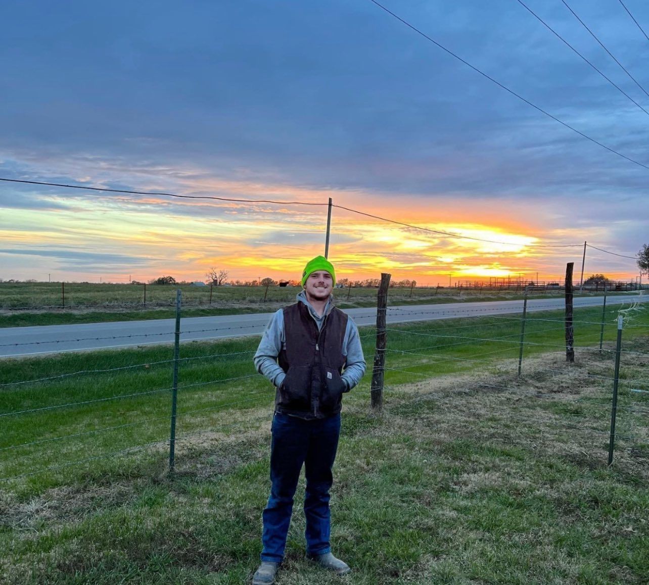
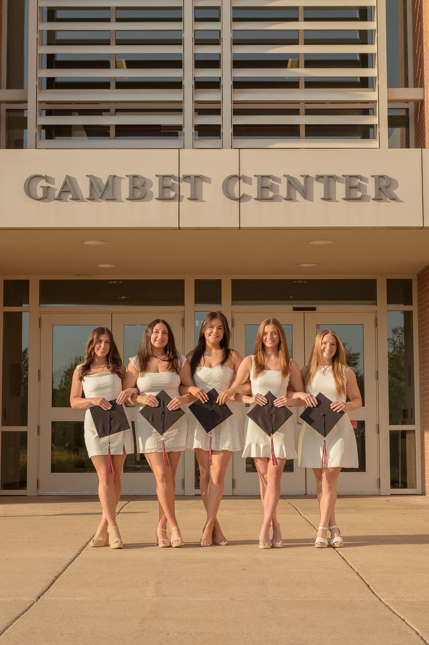
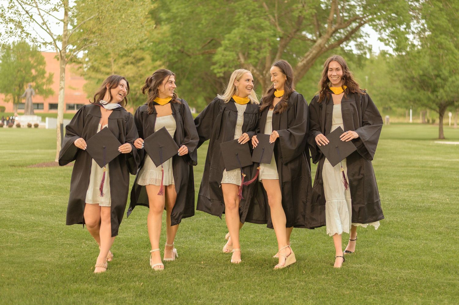
My branding colors aren’t just on my website — they show up in the way I edit your images, too.
When I photograph you, I’m not just documenting a moment. I’m preserving a feeling — and my editing style is designed to match that intention.
I lean into light, warm tones in my edits because I want your images to feel soft, glowy, and real.
You’ll see:
- Creamy skin tones that feel natural and timeless
- Golden warmth that highlights emotion and connection
- Greens and peachy pinks that echo the colors of my brand, tying your gallery into the same sense of peace and heart
It’s all connected: the colors, the feelings, the story.
And it’s intentional.
📸 Why It Matters
You’re not just booking a session — you’re stepping into an experience. And every part of that experience, from the booking email to the final gallery delivery, is shaped to feel cohesive, welcoming, and you.
So yes, colors matter.
They shape first impressions.
They set the mood.
They build trust.
And when used with heart and consistency, they become a visual reflection of what you truly offer.
💛 The Bottom Line
My brand is more than a logo — it’s a promise.
To create an experience that’s warm, grounded, and full of grace.
To edit with care and consistency.
To help you feel at ease every step of the way.
And to deliver photos that feel just like you remembered them — only softer, warmer, and even more beautiful.
And that? That starts with color. 🌿🩷